

university
of derby graduation
the challenge
Graduation ceremonies are among the most visible and time-critical events in the academic calendar, demanding clarity, consistency and reliability across physical and digital touchpoints.
Consistency is key
The challenge was to deliver a high volume of materials across multiple ceremonies and venues.
Aligned branding
The branding had to be consistent and align with the University’s evolving identity, all within tight and immovable deadlines.
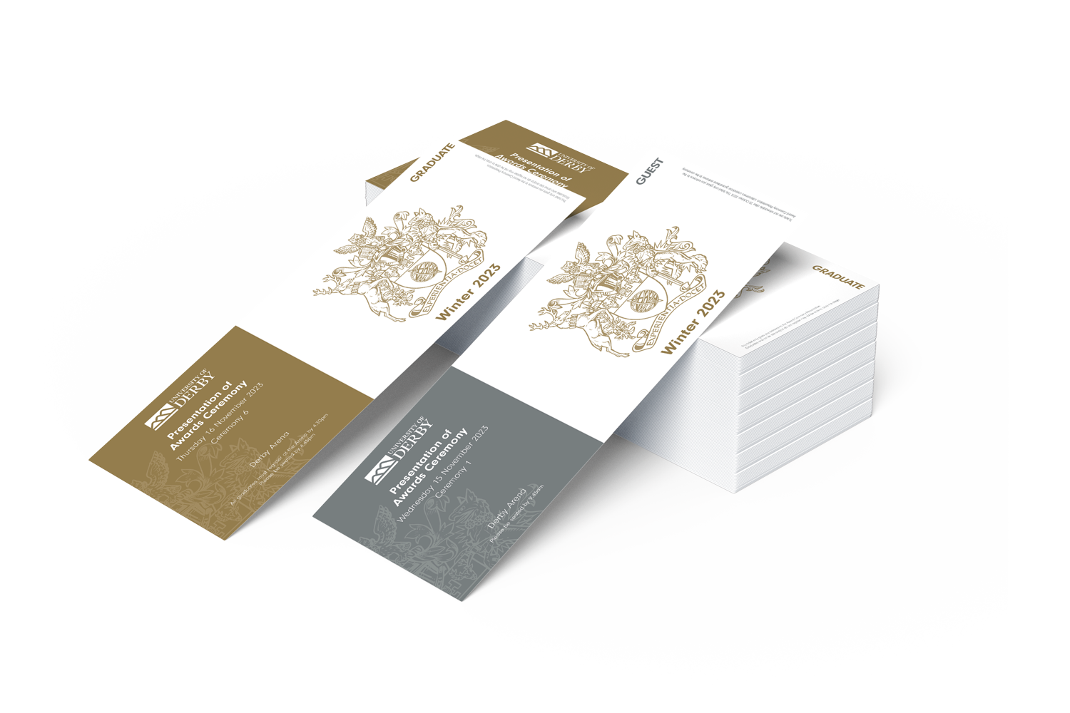
Tickets please
The tickets for the graduation had to be consistent in design but also feel premium. The crest was made a central design element to add to the premium feel of the event.
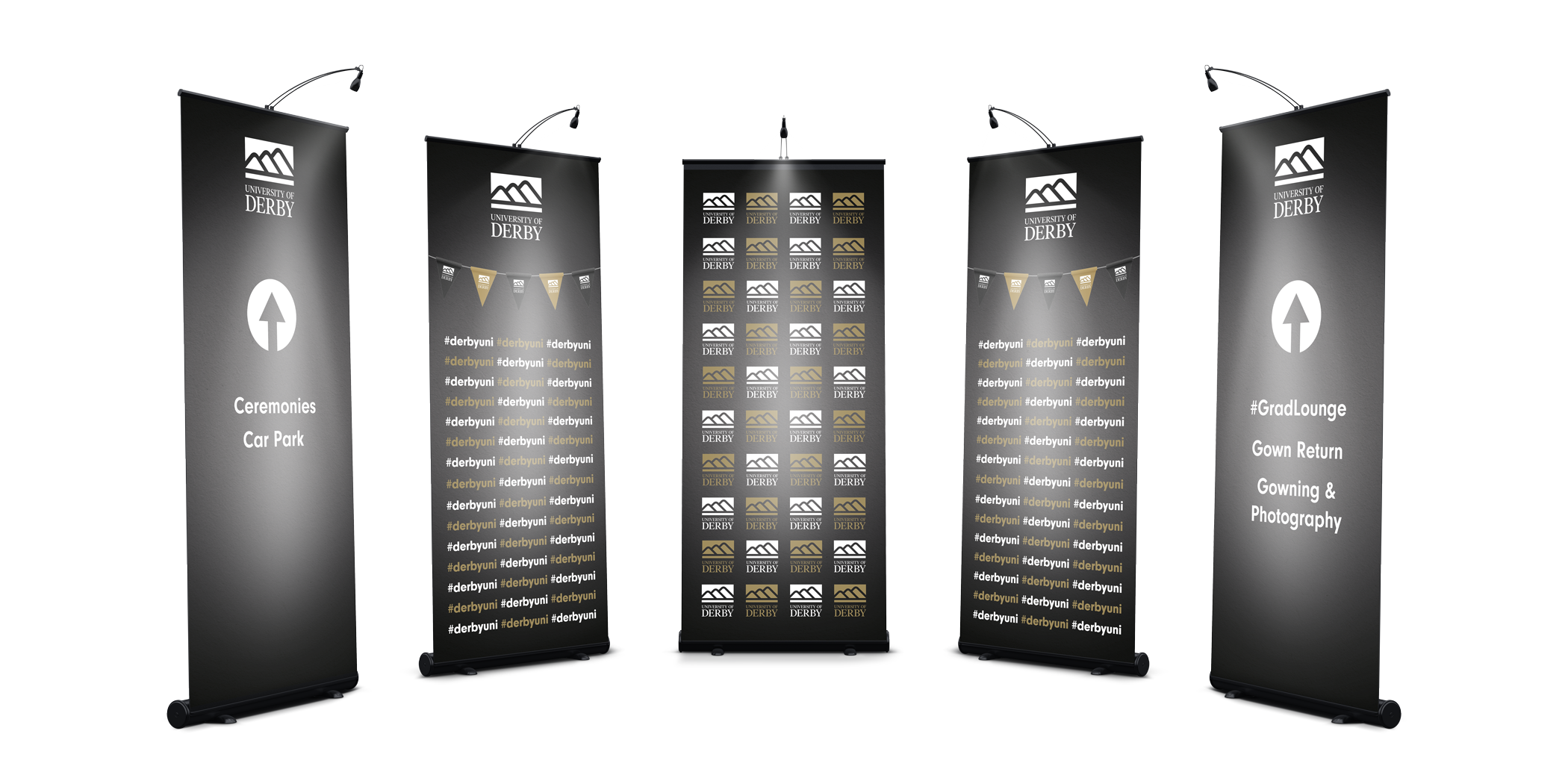
the approach
A clear, repeatable visual system was established across all touchpoints, using the authority of the University crest as the backbone of the identity. This enabled a coordinated suite of materials spanning brochures, tickets, wayfinding, signage and large-format environmental graphics.

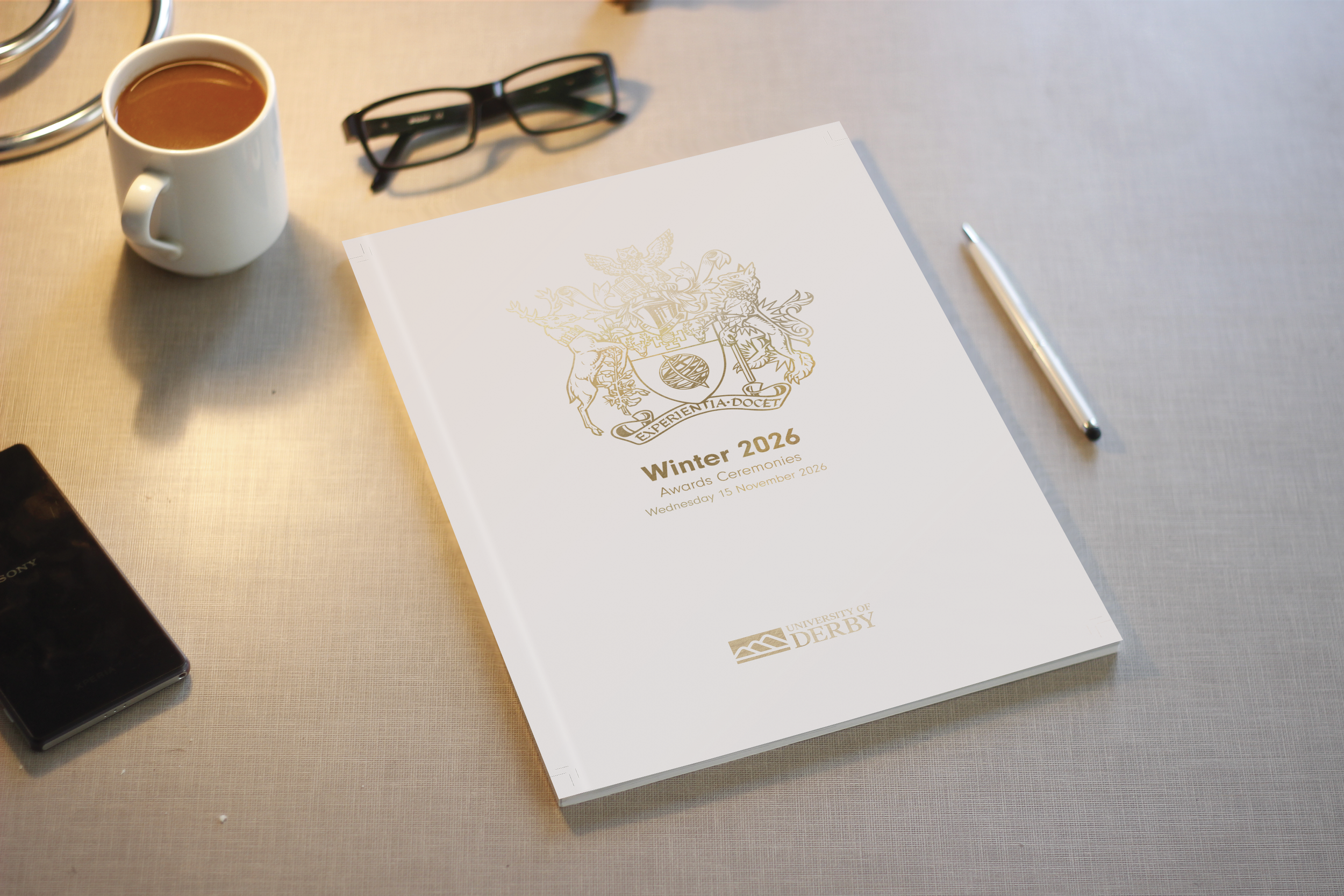
Prestigious print
The graduation brochure, one of the central elements of the event, had to feel premium, modern and consistent with the feel of the rest of the event.
Gold foil blocking was used on the cover to add to the prestige and the names section had to be double and triple checked for accuracy to ensure no one was missed.
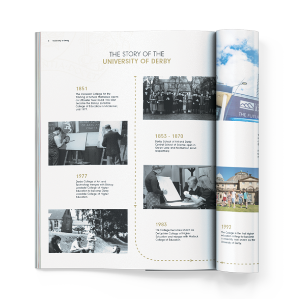
Cover exploration
Variations on the front cover of the PG Prospectus were explored and iterated on before the final version (top) was decided upon.
the outcome
Particular attention was paid to hierarchy, legibility and physical context, ensuring information remained clear and accessible in busy, high-traffic environments. Select print finishes were used to elevate key pieces without compromising clarity or production efficiency, while motion assets extended the ceremony identity into social and on-site digital spaces.